
Role
Product Designer
Duration
1 Month
Tools
Figma
Team
Product Owner, Full-Stack Developer
Platform
Web Desktop

Freight Marketplace, Rebuilt
From Assumptions to User-Driven Strategy
Overview
Problem
In development over five years without user validation, the product assumed corporations would sign up and pay. With no proven demand or strategy, the real challenge was not just improving design, but making it viable for market fit.
Objectives
Find the right users who would actually use and pay for the platform.
Validate assumptions through research.
Create an MVP prototype to attract real customers and test demand.
Solution
Strategy - Identified small business owners as the real users and validated their booking process to ensure market fit.
Design - Built a dashboard MVP that gave importers a real-time view of shipments and quotes, making freight management easier.
Impact
🚀 217 sign-ups in two months from the prototype demo.
⏳ 63% faster quote submission by simplifying the process.
📉 47% lower drop-off rate with a single-page quote request.
Key Screens


Context
I joined Mercury to revive a freight marketplace that had been in development for five years but never tested with real users.
The freight forwarding industry is outdated, relying on email forwarding, manual paperwork, and poor shipment visibility.
Spotting an opportunity to modernize, the Product Owner (PO) built a multi-step quote request system where importers enter shipment details, and freight forwarders respond with quotes.
However, the PO was eager to jump straight into UI design without validation, risking a product that didn’t match user needs.

Challenging Assumptions with Research
PO’s Assumptions
“Corporations will sign up immediately because they need freight services.”
“If we build it, they will pay.”
“The quote request must be multi-step to provide full details to freight forwarders.”
Overcoming Resistance
The PO initially resisted research, believing the existing solution was enough. I gained buy-in by:
Framed research as a risk-reduction strategy to avoid wasted effort on an unproven solution.
Showed competitor analysis proving that successful platforms had low barriers to sign up.
Ran user interviews to gather real feedback that revealed eye-opening insights.
Research Findings → Strategy Shift
Real Users & Needs Identified
User interviews showed corporations were unlikely to adopt an unproven platform, while small businesses ($30K–$5M revenue) needed faster, simpler freight booking and real-time shipment tracking.
Simplifying the Quote Request Form
By identifying small business owners as the real users, I realized the quote request process needed to be simpler and faster. Unlike the PO’s original multi-step approach, small businesses don’t always have every detail ready front.
Rethinking the Subscription Model
The PO wanted an upfront subscription model, but research showed pay-per-use was the industry standard and switching to a competitor was easy. To prevent friction, I proposed delaying subscriptions until we had a strong competitive advantage.
Redesigning the Experience
Mapping the User Flow
Before designing screens, I needed to define how users move through the platform. Using insights from research, I outlined the key steps:
Start on Dashboard → Request a Quote
Submit shipment details
Compare freight forwarder quote options (Cheapest, best Value, fastest)
Book shipment
Manage shipment (Messaging, documents, tracking)

I tested the flow’s logic with stakeholders and adjusted based on feedback before structuring the pages.
Structuring the Platform: Sitemap
Using the user flow, I defined the core sections of the platform:
Dashboard – Overview of shipments and quotes.
Quotes – Request new quotes and manage existing ones.
Shipments – Track booked shipments and manage documents.

Navigation strategy:
Home dashboard as the main entry point
Sidebar for quick access to Quotes and Shipments
Tables for Quotes and Shipments for an easy, scannable view
✅ Validated through: competitor analysis, stakeholder walkthroughs, and ensured scalability.
Designing Key Screens
1️⃣ Dashboard – Central hub with real-time shipment tracking.

2️⃣ Quote Page – Users can view all quotes at a glance, request new quotes.
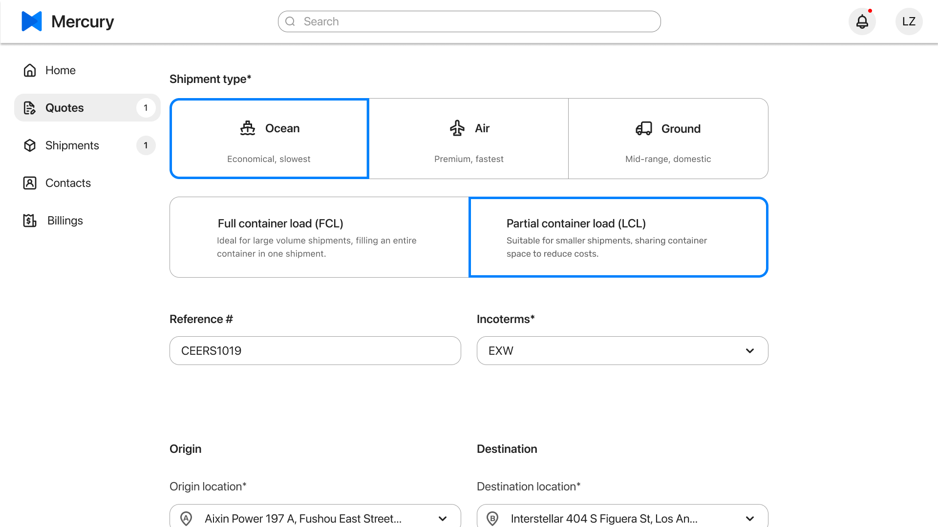
3️⃣ Quote Request Form
The quote request flow was a key part of the platform, but there was disagreement on multi-page vs. single-page design. The PO preferred a detailed, multi-step form, but small business owners wanted a faster, simpler process.
We A/B tested both versions, and the results were clear:
✅ Single-page form was preferred, reducing friction.
❌ Multi-step form had higher drop-off rates due to excessive requirements.

In the final design, the single-page form used progressive disclosure, letting users enter only the necessary details upfront while keeping additional fields optional. This reduced cognitive load and abandonment rates, making it easier for users to get a quote quickly.
4️⃣ Quote Details – Users compare freight forwarders and confirm booking.
5️⃣ Shipment Page – Users can view all shipments at a glance.
6️⃣ Shipment Details
Acts as a central hub for shippers and freight forwarders to communicate, share updates, and manage documents. Users can send messages, upload shipping documents, and track progress, ensuring a smooth shipping process.
Prototyping & Testing
Once the key screens were designed, I built a clickable prototype to test the user experience. I gathered feedback from real users, made improvements, and iterated.
The prototype also allowed the company to demo the platform to prospective small business clients, helping to generate early traction and interest.
Why I Had to Challenge the PO’s Strategy
As a Product Designer, my role isn’t just to push pixels but to ensure the product solves real problems and supports business success. If I had simply executed the PO’s vision, the platform would have launched with:
The wrong audience in mind that wouldn’t have gained traction
A subscription model that deviated from industry norms
A complex UX with a multi-step quote request form
By challenging assumptions, validating user needs, and redesigning the experience, I turned an untested idea into a market-ready platform.
Outcome
Strategic Wins:
Shifted the target market to small businesses for better adoption.
Temporarily halted the subscription mode to lower friction.
Redesigned the quote request flow, leading to higher completion rates.
Expanded the MVP scope to include shipment tracking, addressing a key user need.
Impact
🚀 217 sign-ups in two-months from the prototype demo.
⏳ 63% faster quote submission by simplifying the process.
📉 47% lower drop-off rate with a single-page quote request.
Lessons
This project was a unique mix of strategy, UI/UX, and stakeholder management. It is a reminder that good design isn’t just about screens, but solving the right problems.
Next Steps
As adoption grows, the focus will be on scaling features and refining the UX:
Manage multiple active shipments – Improve tracking for higher shipment volume
Integrated payments – Allow shippers to pay directly on the platform, eliminating manual invoicing.
AI-powered instant quotes – Use historical data to generate freight cost estimates instantly, reducing wait times.